Responsive DataTable when the table is not in viewport
Responsive DataTable when the table is not in viewport
Hello everyone
I have a problem that I cannot solve. I have an API where I request data using axios. The API responds with a json. I prepare the data to be added to the table using:
pt.clear();
pt.rows.add(products_all_data);
pt.draw();
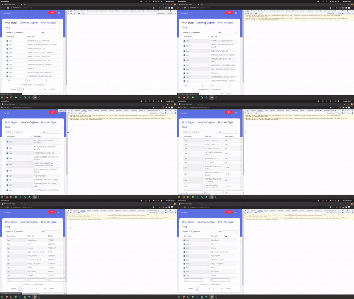
Everything works fine. However, I have multiple (4) tables inside a nav-tabs. This means 3 of the tables are not in the viewport. When I check my design for mobile devices, using inspect element, I see the table which IS in the viewport is responsive (and by that I mean some of the columns are hidden a + button appears to see more) however the tables in other tabs which were not in the viewport are not responsive (tables overflowed outside the container) and as soon as I change the width of the browser, remember I used inspect element, the overflow corrects itself.
This gif may explain the problem better:

Please notice I tested the problem both on Firefox and Chrome.
My question is how to make tables responsive when they are not in the viewport?
This question has an accepted answers - jump to answer
Answers
Datatables can't calculate the table width of hidden tables. You will need to use a combination of
columns.adjust()andresponsive.recalc()when the table is displayed. Similar to this example.Kevin
Thank you very much.
This shows there's no need to be clever with google search.
I tried to use
portview,hiddenalone sidedatatableandresponsive.Only if I searched for
bootstrap tabsanddatatableI might find the solution.Thank you again.