DataTables as inline table with responsive extension
DataTables as inline table with responsive extension
 DataTableFan
Posts: 14Questions: 7Answers: 0
DataTableFan
Posts: 14Questions: 7Answers: 0
How to use the dataTable as inline table? I don't want to use the full width because another inline element should be placed next to it. But there is a bug when used with the responsive extension.
To reproduce the problem:
Go to http://live.datatables.net/rinorupo/3/edit?html,css,js,output
Resize the output window to show all, then hide the last column and afterwards try to get the last column back.
Is there a class to set like https://datatables.net/manual/styling/classes or another solution?
This discussion has been closed.
Answers
Hi @DataTableFan ,
I just tried that and it's working ok for me. I'm using Chrome on Fedora. Could you give steps on what you're doing, please.
Cheers,
Colin
Hi, I tested it with current versions of Chrome and Firefox.
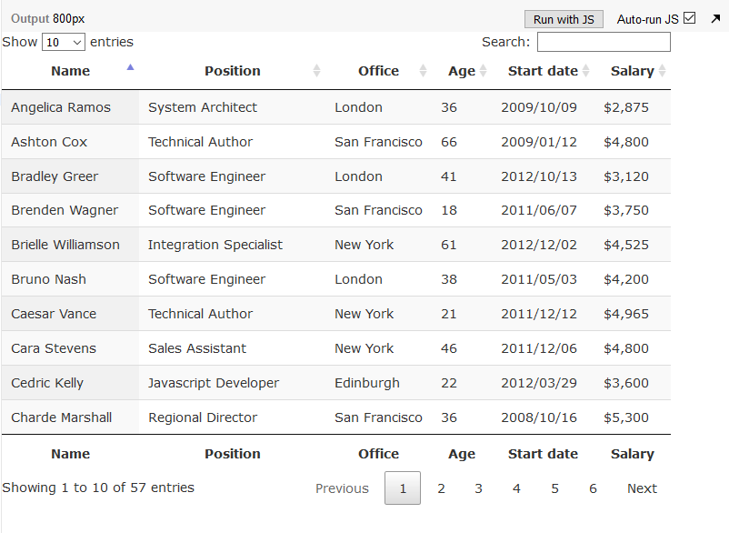
First all columns are visible:
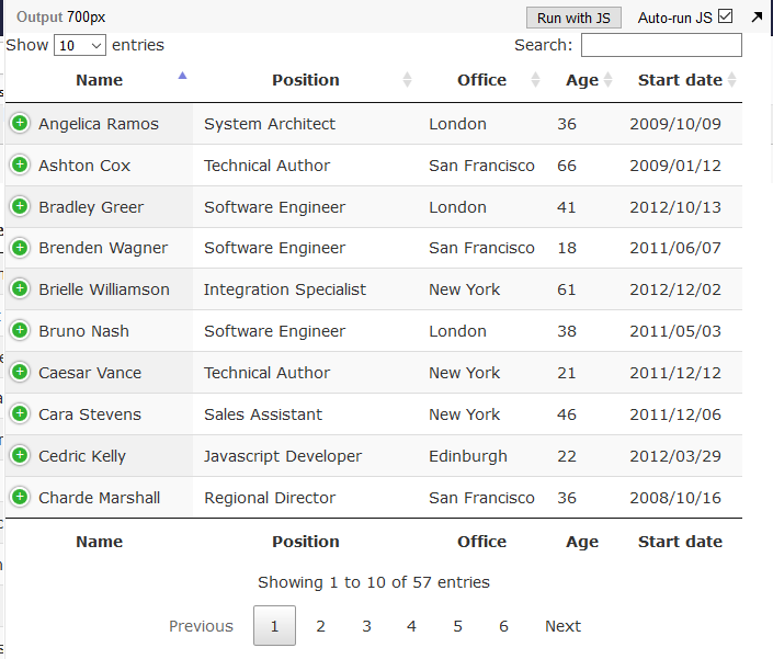
Then the table is resized that the last column disappears because of the responsive extension. Fine so far.
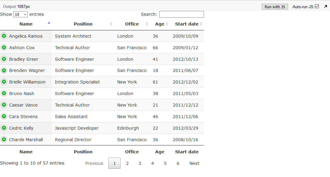
But then when I try to get the last column with a larger window it is still hidden even though there are more pixels available than in at the start:
In some cases responsive works, if for example more columns where hidden. But I can't figure out the logic.
Any suggestions to achieve an inline datatable that works with responsive extension in every case?
Hi,
The issue here is the
inline-blockfor the container - that means it will contract to fit what is available. So Responsive doesn't have any room to attempt to show any extra columns (it doesn't and can't take account of the white space outside of the container you've put it in).There is an element of random luck here - if you get it at the right moment in the draw cycle and the inserted measurement table Responsive uses forces the container to be a touch wider (since its inline-block), allowing Response to show extra column(s).
If you want to have the table collapse, remove the
width="100%"and also usestyle="width:auto;". Don't use theinline-block.Allan
Hi,
If I use
style="width:auto;"the table itself behaves as expected (with responsive extension). But the wrapper (because of the default of a div) still uses 100% (live.datatables.net/rinorupo/7/edit).Therefore nothing can be placed next to it, mouse distances are long, ... .
Is it possible to get a kind of "inline-table" for the whole table with(in) wrapper, search and pagination sections? A pure css-Solution would be preferable")
You still have the
width="100%"attribute in the HTML there. Removing it allows the table itself to not expand to be 100% width: http://live.datatables.net/rinorupo/8/edit .The container around the table is a little more difficult since it is a block element. I'm not actually certain how to modify it to allow Responsive to always work without some kind of outer container that uses flexbox or similar.
Allan
Thank you for your efforts,
The container definitely has to receive an inline behavior like
display:inline-block,display:inline-flex,display:inline-grid,float: left, ... .Therefore I made a prototype that is working just in current chrome: http://live.datatables.net/rinorupo/16/edit . The responsive extension recalcs the columns after changing the containers width.
Unfortunately it has a flickering but it shows what I want to achieve.
Hopefully someone can deliver a better solution than mine")